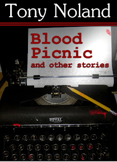
But the cover... ah, the cover...
I went through various iterations of it. Clean keys, bloody keys, etc. I finally settled on a version I liked:
It looks pretty good. Bold visual elements, title and author byline in a clearly legible font with good contrast, font size large enough to read in a thumbnail. Great, I'm good to go!
 |
| A screen-capture from Amazon |
So, back to the GIMP for a redesign. After some discussions on Twitter, I moved my name to the top, added some visual breaks and let the title be more central to the page.
What do you think?
===== Feel free to comment on this or any other post.


Interesting that you use Gimp, Tony. I had it on my old computer but I had a lot of problems with it crashing.
ReplyDeleteI have Photoshop 4 now, but it came with the computer.
Must watch that Kindle Icon, too. I've never checked my covers to see if it blocks anything.